Posts from June 2006

Beavs Win!

I'm not a big sports fan, and to be honest I didn't watch a single Beavers baseball game this year until last night. But it's fun to see the hometown team succeed on the national stage: OSU wins College World Series. Go Beavs!

Update: The big news around here is that this mob-loving town of 50,000 didn't erupt into an orgy of violence after the win: No Riots After Win.

Linux These Days

I've been flirting with Linux as a desktop OS on and off over the years, but I've never made a commitment. I'd install Linux on an old machine, but then I'd hit some stumbling block and the machine would sit in the corner gathering dust. A big part of the problem was the interface. Years ago the graphical interface part of Linux didn't ever feel right. The fonts were odd, the Web browsers (even Netscape) rendered pages in strange ways, and the menus were clunky. Not to mention the nightmare of finding drivers for your specific hardware. So I've never really had a Linux machine around the house for testing Web pages, surfing, and writing email.

A couple weeks ago I put Revolution OS into my Netflix queue, and relived the early days of Linux. I even paused and slow-mo'd through the Linux World '99 crowd shots, hoping I'd catch a glimpse of my younger self. (I was there, but not caught on film.) The movie was made in 2001, and the punchline is that it ends with Linux companies like Red Hat storming the stock market, future unlimited—with only a brief mention of the crash that followed in text at the very end.

Anyway, the movie prompted me to give Linux a try again. After looking around for a bit, I decided to try out Ubuntu on a Dell Inspiron I'd abandonded for a Powerbook. Ubuntu is a night and day difference from my earlier Linux experiences. It was simple to install, looks good, and comes with Firefox. (I think they actually had some designers working on the interface. No offense, engineers.) I even popped in a wireless card and it just worked! (Thanks, engineers.) I didn't have to go searching for drivers, or edit obscure text files with cryptic settings. The interface still felt a bit odd to me, but I followed this tutorial—HOWTO: Hoary ClearType-like fonts—and suddenly the interface looked very familiar. (Alas, some cryptic text editing is required.)
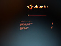
ubuntu

I'm not going to give up my Powerbook in favor of my new Linux laptop yet. But I'm amazed at how far Linux has come in a few years. I still need to find a good code editor and office-type programs, which might ultimately be the next stumbling block. At least I finally have a Linux machine that's usable, and more importantly, feels like the computer interface I'm used to.

Secure Google Calendar

A while back I posted that I switched to Google Calendar for managing my schedule, and I showed how I dumped a batch of dates into a calendar to get started: Add a batch of dates to Google Calendar. I've been using it every day now for two months, and it simply blows away every other online calendar I've used. I'm sharing dates and times with sk, keeping track of project milestones, birthdays, and holidays all in one space.

With all of this personal data flying around, I think it's important to use a secure connection when I connect to Google Calendar. Google offers an SSL connection, but they don't encourage it. In fact, even if you change your Google Calendar bookmark URL to https, you'll often be redirected to a plain old http connection. boo, Google! That's why I've found Mark Pilgrim's GMail Secure Greasemonkey script invaluable. It's built to force a secure connection for GMail, but the script itself is so generic that it works for other sites. Here's how to get the script working with Google Calendar:
  1. Install GMail Secure
  2. Choose Tools -> Manage User Scripts... from the Firefox menu
  3. Highlight GMailSecure, and click Add next to Included Pages
  4. Add two entries:

    http://google.com/calendar*
    http://www.google.com/calendar*

  5. Click OK to close
With this script installed, I know my connection with Google Calendar will be secure no matter how I get there. (And as a bonus, my GMail account is secured as well.) Sure, Google knows where I'll be at all times, but at least no one in the middle will.

Better Amazon RSS Feeds

A few years ago I put together a little tool to help assemble RSS feeds of Amazon products called the Amazon RSS Feed-Builder. I've been using feeds generated with this tool for about three years, tracking the latest books, music, and DVDs across series and artists that I like. Because publishers often announce books to Amazon well in advance, I know about new books in the Hacks Series well before O'Reilly announces the books on their own website. Amazon also offers pre-built feeds on their Amazon Syndication page.

These old-style Amazon feeds have worked well at alerting me about new products, but they are fairly limited. I just see the title, the author, and a price in my newsreader. I decided to upgrade my Amazon feeds so each item includes a product image (if available), a product description, and product details. And I figured if I was going to go through the trouble of upgrading my feeds, why not just upgrade the Amazon RSS Feed-Builder? So here's the new thing:

Amazon Feed Generator

It's hot off the assembly line today, and I'm sure there are bugs to be worked out. (It's also powered by orange gradients.) If you want to give it a shot, feel free to try it out and post any comments/problems on this post. As an example, here are the latest books in a Polar Exploration Feed. I subscribe to this feed, and I'm notified whenever new books about polar exploration show up in Amazon's catalog.

This uses the latest version of Amazon Web Services, with a custom stylesheet and Amazon's server-side XSLT service. And I want to say thanks to Alan Taylor for his recent article subtitled, AMZN-XSLT-JSON-AJAX (AXJA?). His stylesheet is a perfect example of consuming the new, more-complex AWS responses with XSL.

Polar Exploration

A mini-obsession of mine right now is polar exploration. (Not actual polar exploration, just reading about it.) When we were in New Zealand last February, sk and I went to the Canterbury Museum in Christchurch where they have a permanent exhibit about Antarctic exploration. The most fascinating part was seeing artifacts from early expeditions by Ernest Shackleton and Robert Scott. (Seeing their gear in person makes their survival stories even more compelling.) When I got back, I picked up Caroline Alexander's excellent account of Shackleton's failed Endurance expedition (aptly titled The Endurance), which includes hundreds of photos by Frank Hurley—the meticulous and talented expedition photographer. I've been reading the book very slowly, taking time to study the incredible photographs. The book text uses diary entries from several members of the crew, and often reads like weblogs. The crew complain about each other, praise each other, and paint a very personal picture of what they were going through.

And speaking of polar blogs, I recently tuned into Ben Saunders' blog. He's currently training in Greenland for an expedition in October to retrace Robert Scott's 1912 South Pole attempt. He's literally following in the footsteps of the early polar explorers, and posting photos and diary entries along the way thanks to a digital camera and satellite phone. Saunders recently posted about how he's able to blog from the middle of nowhere: Arctic Geeks.

ORblogs Turns Three

I run a site that pulls together blogs and posts by people in Oregon called ORblogs. The idea started as this post on this site: Oregon Weblogs, after I met Michael Buffington and Nick Finck for the first time at SXSW in Austin that month. I found out they both lived about 45 minutes away and I thought there should be some way for local bloggers to find each other.

I set up ORblogs.com with a simple link list of the Oregon bloggers I could find. Then a few months later (three years ago today) I moved from a simple list of links to a database-driven site that gathers posts and information about the blogs. And I moved from actively finding weblogs, to making the site a voluntary, participatory space. In fact, if you go to the blog detail page for this site—onfocus at ORblogs—you'll see that the date my weblog was added is June 3, 2003. A quick SQL query tells me there are 58 weblogs that are still active and were added that day. There are currently 1,055 active weblogs in the directory.

I've been able to virtually get to know a number of my fellow Oregonians by reading the site daily for three years, and I think it's helped me get to know my city and state better than I would have otherwise. I've even met a few bloggers in person, and I'm not sure that would have happened without the site. I also appreciate the fact that I see diverse viewpoints from people across the state. I don't always agree with everything I see flowing through ORblogs, but I think it's healthy to read outside of my normal ideological bubble once in a while.

So I just wanted to mark the milestone with a post. I always have grand plans for ORblogs, a whole stack of ideas I'd like to implement that would help connect Oregon bloggers and their ideas together. (I've been talking with people about an ORblogs get-together forever, that'd be a fun way to connect with other bloggers too.) But the site is a side-project, and I'm not making any money from it. Hopefully someday I'll figure out how to turn the intangible value I feel from participating at the site into tangible value so I can focus more time at ORblogs—a classic personal Web dilemma.

I'd also like to take this post to say thanks to all of the Oregon bloggers who have chosen to participate at ORblogs, who bother pinging the site, and who are teaching me more about Oregon every day. The site wouldn't exist without the Oregon blogosphere collectively nodding in ORblogs' direction.

Add Borders to Flickr Images

Flickr's recent move from beta to gamma introduced a slew of changes to the look and feel of the site. Most of the changes seemed to be centered around navigation, and finding ways to give quick access to all of Flickr's features. All well and good.

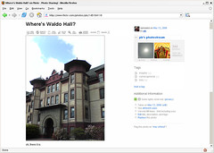
However, there was one fundamental design change in the upgrade that affects every image you view on Flickr—they removed photo borders. Flickr used to display a 1-pixel wide gray border around every photo, both on photo detail pages, and on photostream pages. This border was important because it separated the photograph from the background. The effect is subtle most of the time, but has a big impact with certain photos. Here's an example:

Flickr without borders

This photo of mine on Flickr has white at the edges, and without the border the photo bleeds into the background. Obviously you can imagine where the photo ends and page begins by drawing a mental line from the colored parts of the photo through the white parts of the photo. But the gray border used to do that work for you, and in the process made the site feel more solid.

Luckily, because I use Firefox, I can change the look of Flickr with a few lines of CSS. I put the gray border back on both image detail pages and photostream pages, and I'm already more productive thanks to eliminating the mental strain of imagining borders around photos. If you'd like to give your brain a little less work while browsing Flickr, here's how it's done:
  1. Locate your Firefox profile folder.
  2. Open the chrome folder and open the file userContent.css in a text editor like Notepad. (You might have to create the file if it doesn't exist yet.)
  3. Add the following bit of CSS to the file: @-moz-document domain(flickr.com) { .reflect { border:solid #999 1px !important; } .Photo img { border:solid #999 1px !important; } }
  4. Save userContent.css and restart Firefox.
That's all there is to it. Once the custom styles are in place, you'll see a Flickr with borders again:

Flickr with borders

I think light gray (#999) is the best color for the border, but you can make it lighter or darker by adjusting the value lighter (#ccc) or darker (#666). You might also experiment with padding and background colors if you want to mimic the white/gray borders I often use for photos here.

If you're not already obsessing over details like this, try tuning in to photo borders at other sites and in photo applications. Of course you're not supposed to notice the border (or lack thereof). But like any physical frame, pixel borders can enhance or detract from your photographs.

Update: After living with this for a day or two, I decided to go with a lighter gray border, #ccc. Just change #999 to #ccc in the CSS above if you'd like to do the same.